Designed and built by the same person
Which is the whole point. A design that survives the build is one where the person drawing it knew what it would cost to make, and the decisions below are as much about structure as surface — what loads, what the visitor is asked first and what the markup says the page is.
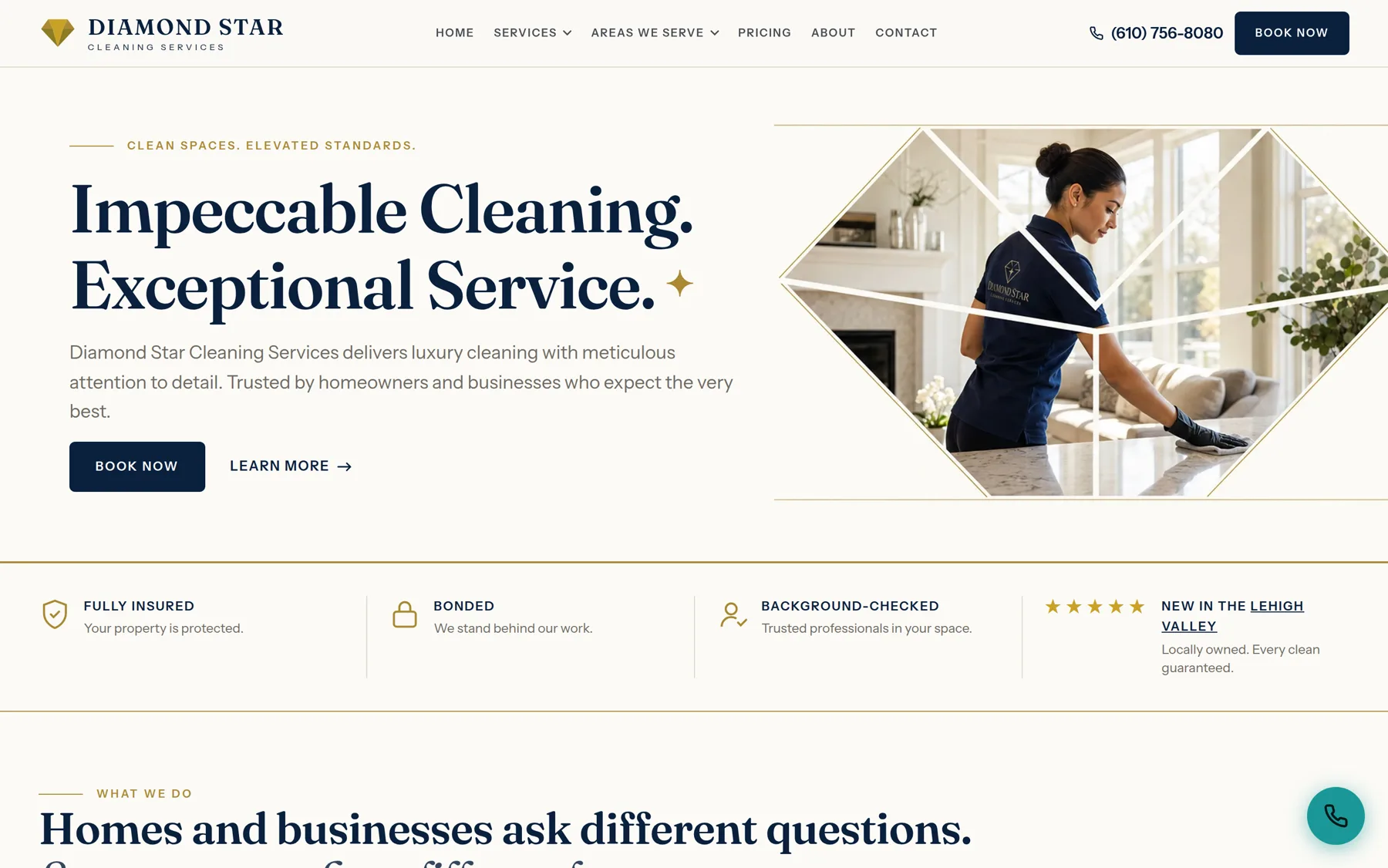
Diamond Star Cleaning Services
Brand and bilingual marketing site · 2026
Refined local luxury for a category that usually settles for a stock photo and a phone number. The facet geometry masking the hero image is cut from the logo mark, Fraunces carries the display type against Instrument Sans, and the gold is rationed hard enough to read as metal — it never fills a button, because at this tone it fails contrast against white and turns muddy against dark. The whole system is written down as rules the build gets checked against rather than left in someone's head.
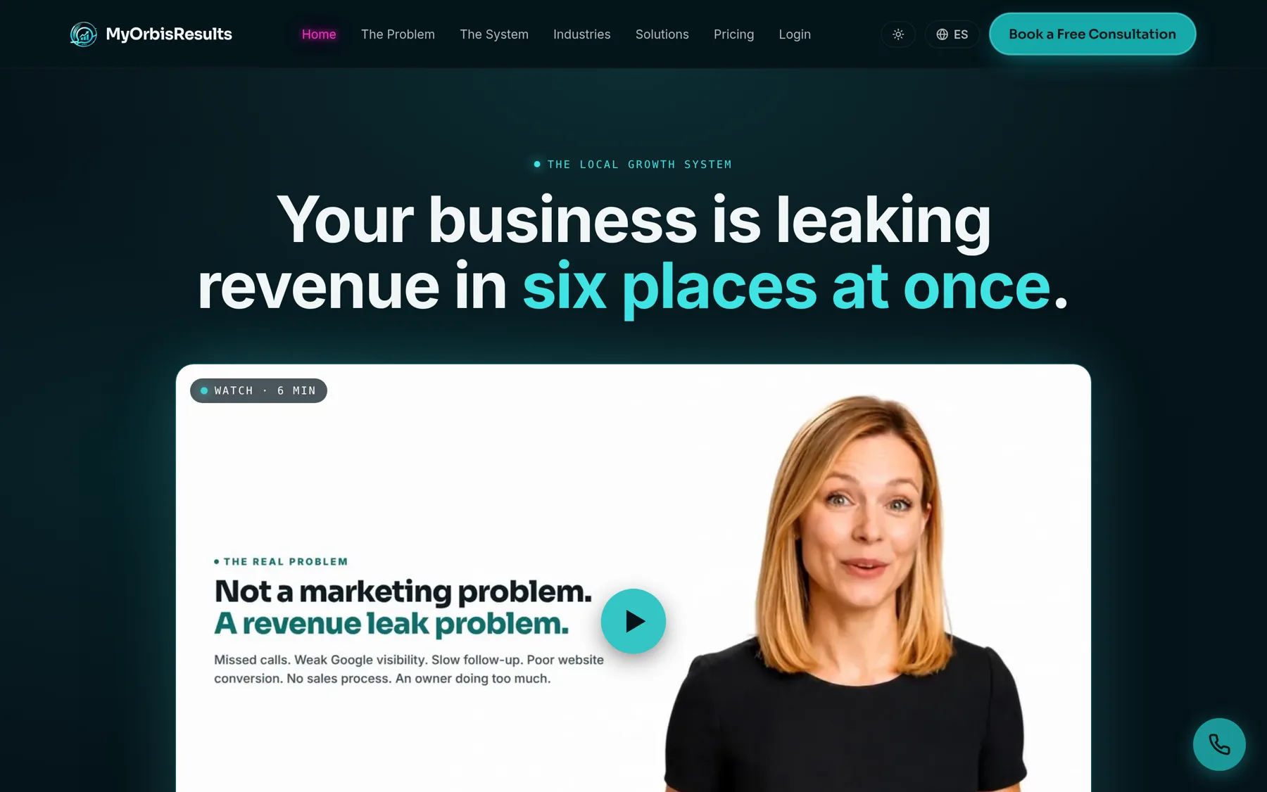
MyOrbisResults
Platform marketing site · 2026
The opposite register to Diamond Star, deliberately: dark, technical, and built around a single claim rather than a list of features. Colour does one job — it marks the half of the headline that carries the argument — and the video sits where a feature grid usually goes, because the thing being sold takes six minutes to explain and no amount of bullets shortens it.
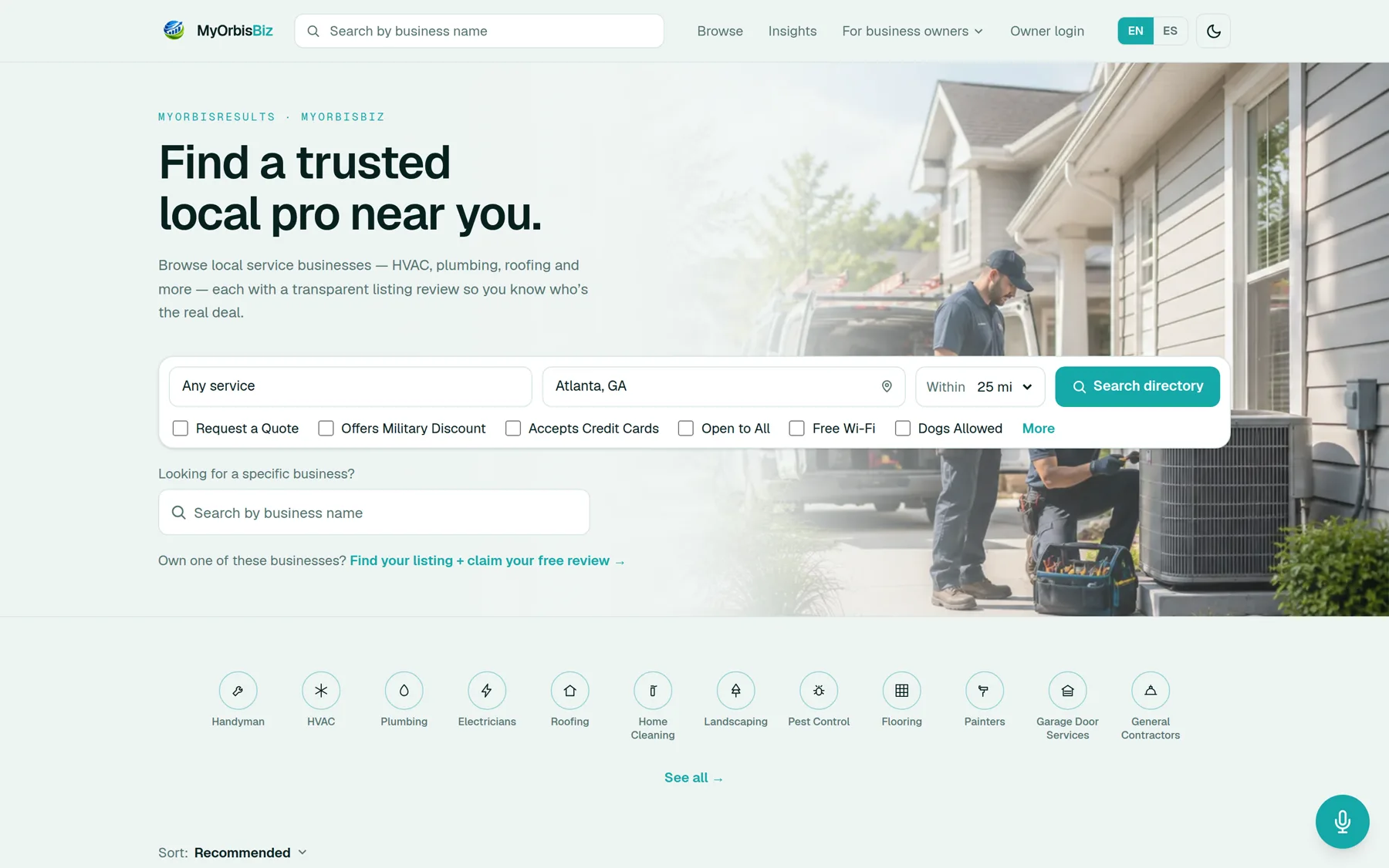
MyOrbisBiz
Product interface · 2026
A directory is a search problem before it is a design problem, so the search is the hero: service, location, radius, then the filters people actually use to rule businesses out. Bilingual and dark-mode from the first commit rather than retrofitted, and the category icons are one drawn set rather than an icon font, which is the difference between a product and a template.
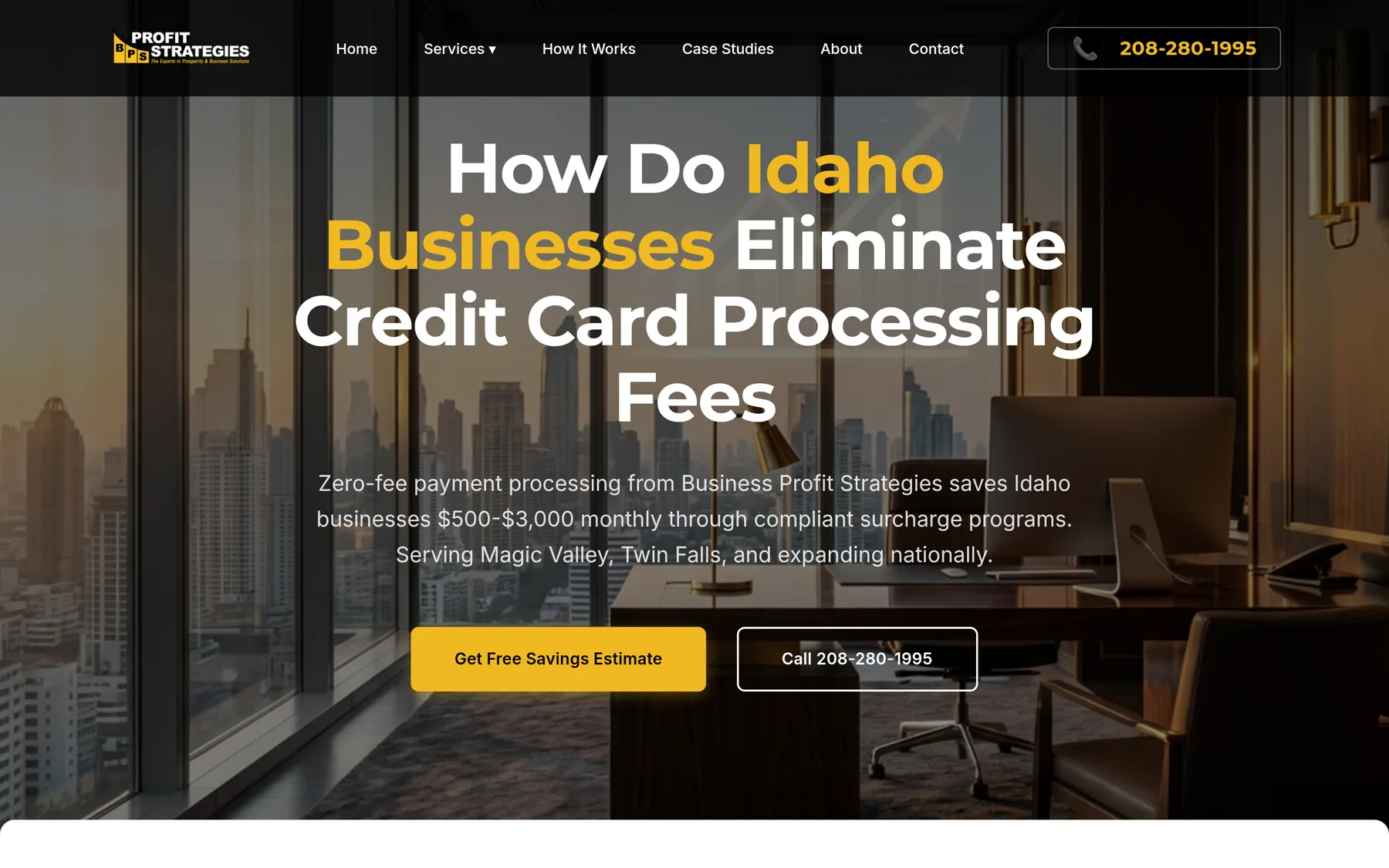
BPS Profit Strategies
Marketing site · 2026
A category where every competitor leads with a promise, so this one leads with the question the owner is already asking — and answers it with a range rather than an adjective. Gold marks only the two words that place the claim — “Idaho Businesses” — the savings figure is specific enough to be argued with, and the primary action is an estimate the visitor runs themselves rather than a form that asks them to take it on trust.
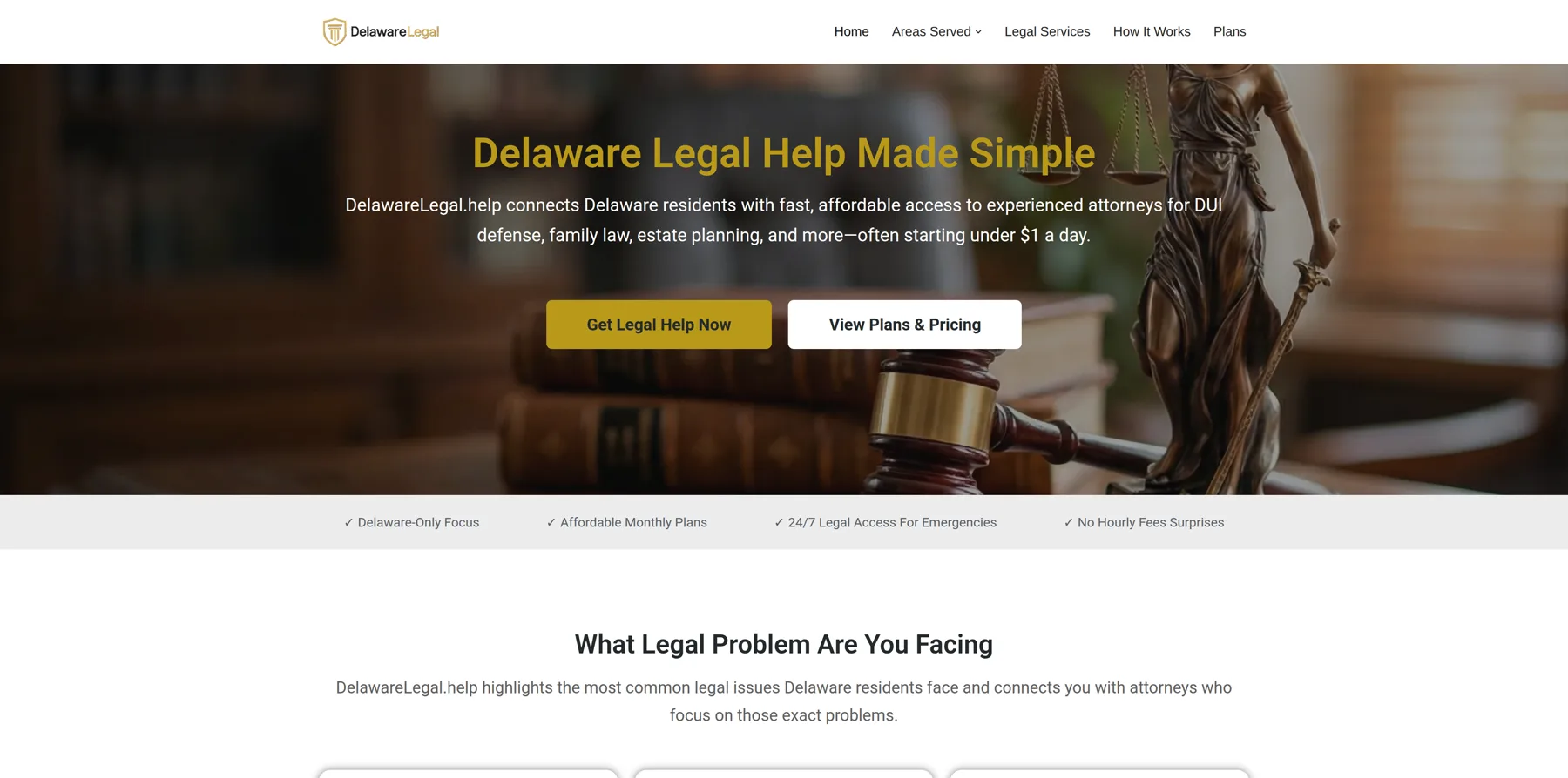
DelawareLegal.help
Information architecture · Contract
The design decision here is the site map, not the surface. The brief was a site that did not read as an affiliate funnel — so it routes by the problem the visitor arrived with rather than by the membership tiers being sold. DUI, family, estate, property, business, civil. A page that answers the question someone arrived with, before it introduces anything for sale, earns the right to make the offer — which is the only version of persuasion worth building.
What is not here
Not every project makes a good screenshot, and a few of the ones that rank best photograph worst. Where the interesting part of a build is what it does rather than how it looks — a search result, a pipeline, a register — the evidence sits on the case study instead, because that is where it can actually be checked.
Available for contract work now.
Design and development in one pass, direct or white-label under your own name. If you are an agency with a build you cannot staff this month, what that looks like is written up here. Otherwise the fastest route is an email.